IS&T Website Redesign

I worked on a UX redesign project for the Utah Valley University Information Systems & Technology (IS&T) website, we aimed to enhance user engagement and improve the overall experience. Our primary objectives were to revamp the site’s structure, design an inviting homepage with original imagery, and cater to non-traditional students by integrating effective call-to-action elements and reducing repetitive content.
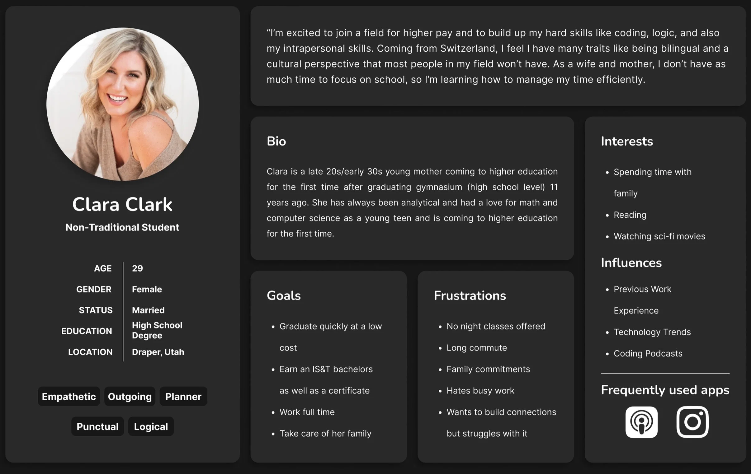
To understand the needs of non-traditional students, my team conducted surveys, interviews, and usability tests, including eye-tracking studies. These insights helped us identify pain points and preferences, allowing us to streamline the user journey.
■ OVERVIEW
■ THE PROBLEM
The IS&T website needed a comprehensive redesign to address significant usability challenges and improve engagement, particularly for non-traditional students. Through initial research and stakeholder feedback, we identified three critical problem areas:
1. Ineffective calls-to-action (CTAs): Existing CTAs lacked clarity and failed to guide users toward desired actions, such as requesting information or exploring program offerings.
2. Navigation issues: Key information, such as program details and advisor contacts, was difficult to locate, leading users to navigate outside the IS&T site.
3. Lack of engagement: Non-traditional students reported feeling disconnected from the website due to static content and an unappealing design.

To address these problems, we decided to use a combination of user surveys, eye-tracking studies, and usability testing to gain actionable insights into user behavior and preferences. Each challenge required its own tailored solution:
Lack of engagement → Visual redesign with original imagery
Navigation issues → Improved site structure and internal links
Ineffective CTAs → Streamlined, action-oriented elements
By taking a data-driven approach, we ensured that each solution targeted the core issues while aligning with the needs of non-traditional students.
■ RESEARCH
To create a user-centered redesign of the IS&T website, we conducted comprehensive research to understand the needs, pain points, and behaviors of our target audience. This research process combined multiple methodologies, including surveys, eye-tracking studies, and collaborative white boarding exercises. By combining these approaches, we were able to gather actionable insights and build a solid foundation for the redesign.
Survey
Our research began with a survey distributed to both current and prospective students. The goal was to uncover their experiences with the IS&T website, what they found useful, and areas where it fell short. For our survey, we decided to ask the participants both quantitative and qualitative questions, such as:
“How clear are the labels on the website?”
“How old are you?”
“Are you or have you been a non-traditional student?”

From the responses, we learned that non-traditional students prioritize clarity and efficiency in a website, often using it to find program details, advisor contact information, and course requirements. Many respondents expressed frustration with outdated visuals and the lack of intuitive navigation, with some noting that they often resorted to external resources for information. These findings showed the need for a streamlined design with a clear structure and engaging visuals.
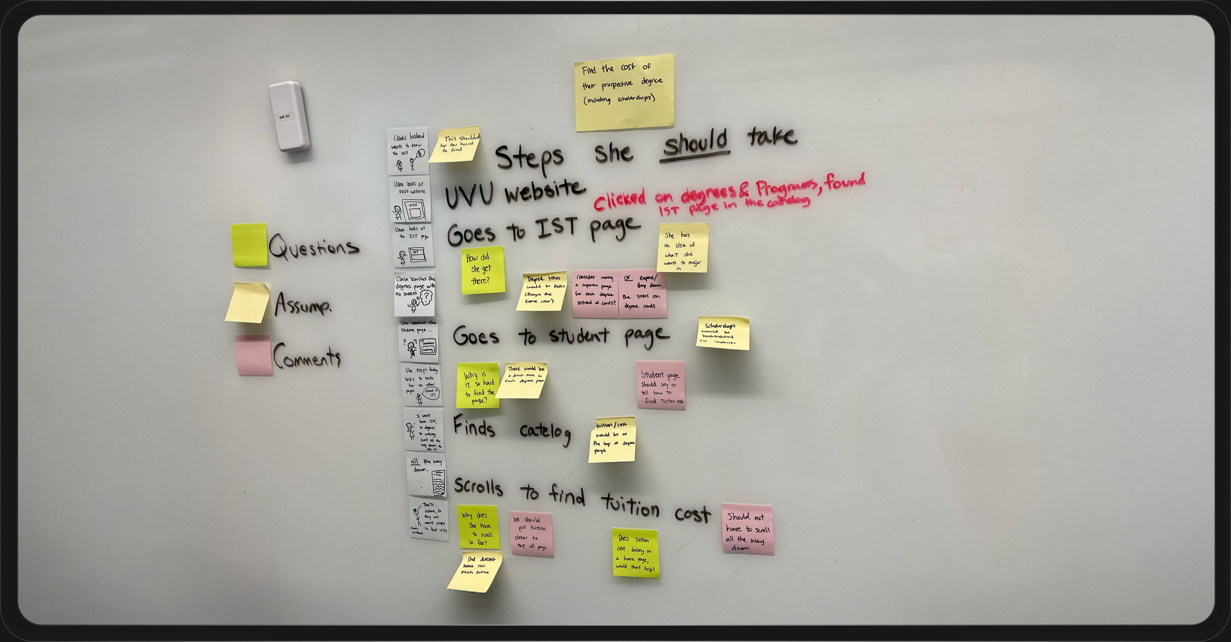
Eye Tracking
Building on the survey data, we conducted eye-tracking studies to observe how users navigated the current IS&T website. Participants were tasked with completing specific actions, such as locating program details and advisor contacts, while their eye movements were tracked in real-time. This method revealed several key patterns:
Users frequently skipped over static content blocks, gravitating toward visually prominent links and buttons.
Some pages caused confusion, leading participants to scan back and forth repeatedly, indicating poor information hierarchy.
Participants often exited the IS&T website prematurely, navigating to other UVU resources to complete their tasks.