
A Redesign Students Actually Needed
Overview
I worked on a collaborative UX redesign project for the Utah Valley University Information Systems & Technology (IS&T) website. Our goal was to enhance user engagement and improve the experience overall. We wanted to totally revamp the websites structure, design an innovative landing page with original imagery, and cater specifically to non-traditional students by integrating effective call-to-action elements and reducing any repetitive content.
To better understand the needs of non-traditional students, me and my team conducted surveys, interviews, and usability tests, including eye-tracking studies. These insights help us to identify pain points which allowed us to streamline the user journey.
The Problem
The IS&T website needed a comprehensive redesign to address significant usability issues and improve engagement for non-traditional students. Through initial research and stakeholder feedback, we identified three critical problem areas:
Ineffective calls-to-action (CTAs): Existing CTAs lacked clarity and failed to guide users toward desired actions, such as requesting information or exploring program offerings.
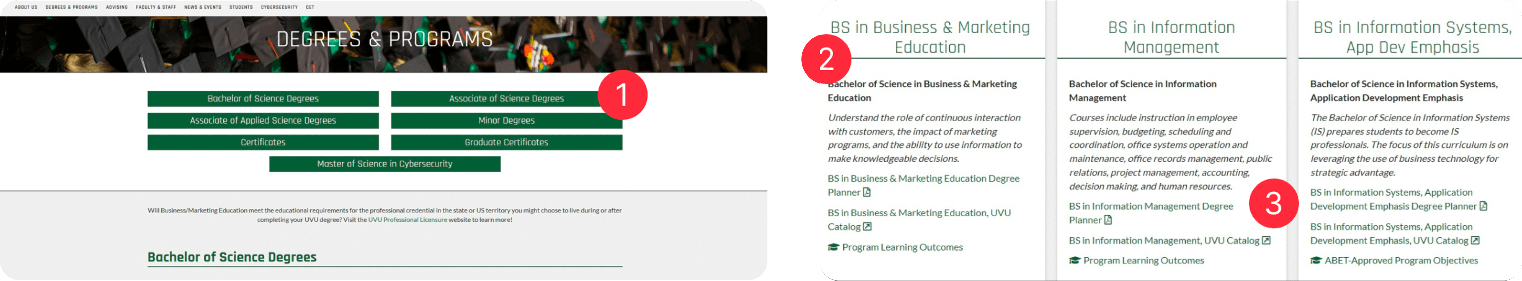
Navigation issues: Key information, such as program details and advisor contacts, was difficult to locate, leading users to navigate outside the IS&T site.
Lack of engagement: Non-traditional students reported feeling disconnected from the website due to static content and an unappealing design.
To address these problems, we decided to use a combination of user surveys. eye-tracking studies, and usability testing to gain insights. Each challenge required its own tailored solution:
Lack of engagement → Visual redesign with original imagery
Navigation issues → Improved site structure and internal links
Ineffective CTAs → Streamlined, action-oriented elements
By taking this data-driven approach, we were able to make sure that each solution targeted the core issue while aligning with the needs of non-traditional students.
Survey
Our redesign began with a survey distributed to both current and prospective students. We wanted to uncover their experiences with the IS&T website, things they found useful, and areas that fell short. For the survey, we decided to ask participants both quantitative and qualitative questions, such as:
"How clear are the labels on the website?"
"How old are you?"
"Are you or have you been a non-traditional student?"
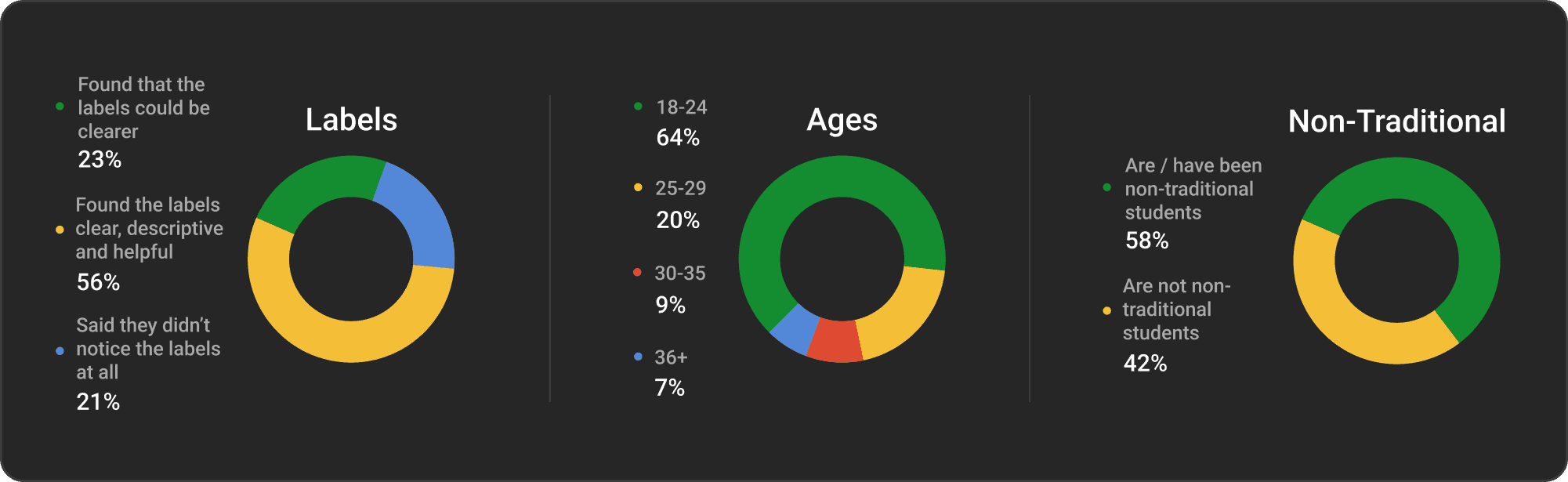
From the responses, we saw that non-traditional students prioritize clarity and efficiency in a website. They often used the website to find program details, advisor contact information, and course requirements. Many participants expressed some frustration with outdated visuals and the lack of intuitive navigation. Others noted that they often had to resort to external resources for information. These findings showed the need for a streamlined design with very clear structure.
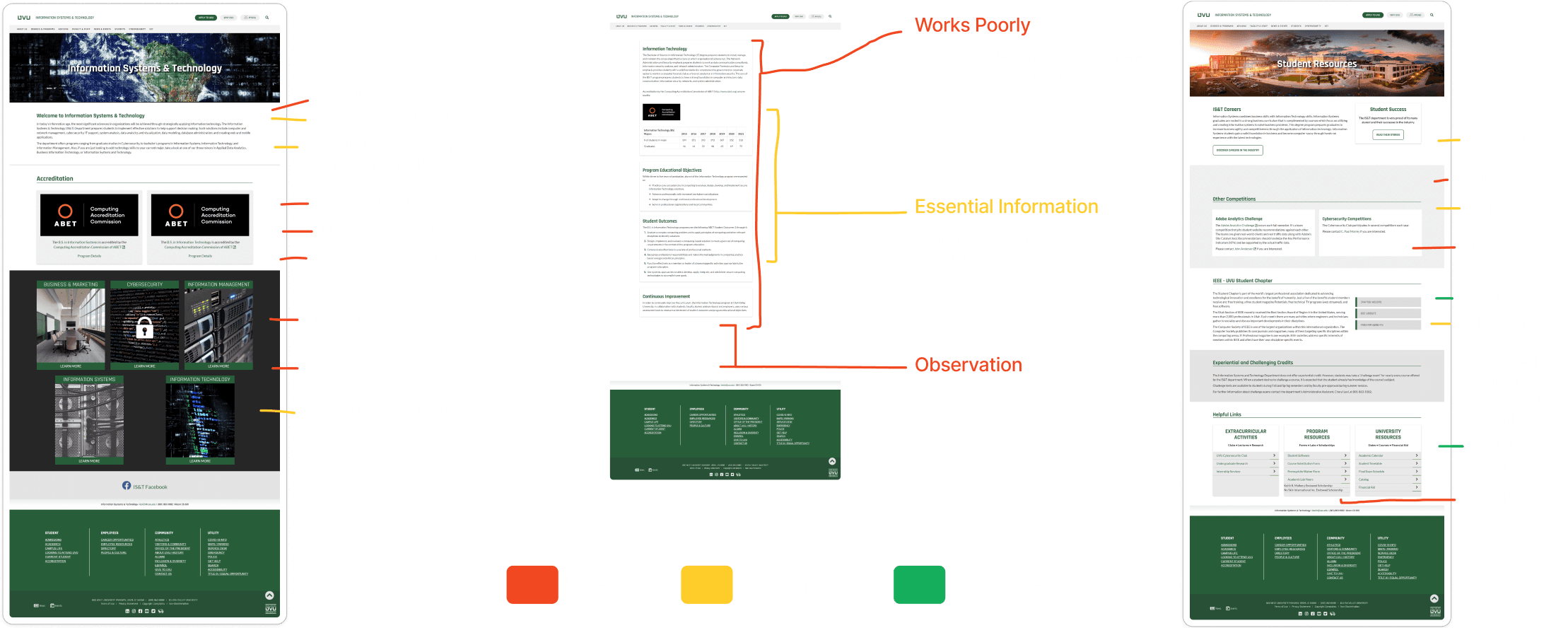
Eye-Tracking
Building on the survey data, we conducted eye-tracking studies to observe how users navigated the current IS&T website. Participants were tasked with completing specific actions, such as locating program details and advisor contacts, while we tracked their eye movements in real time. This method was effective and revealed some key patterns:
Users were frequently skipping over static content, gravitating towards visually prominent links and buttons.
Some pages caused confusion, leading people to scan back and forth repeatedly, which indicates poor information hierarchy.
Participants often exited the IS&T website prematurely, navigating to other UVU resources via the navigation to complete their tasks.
These findings showed us that we really needed to prioritize placement of key information to reduce cognitive load and keep users engaged.
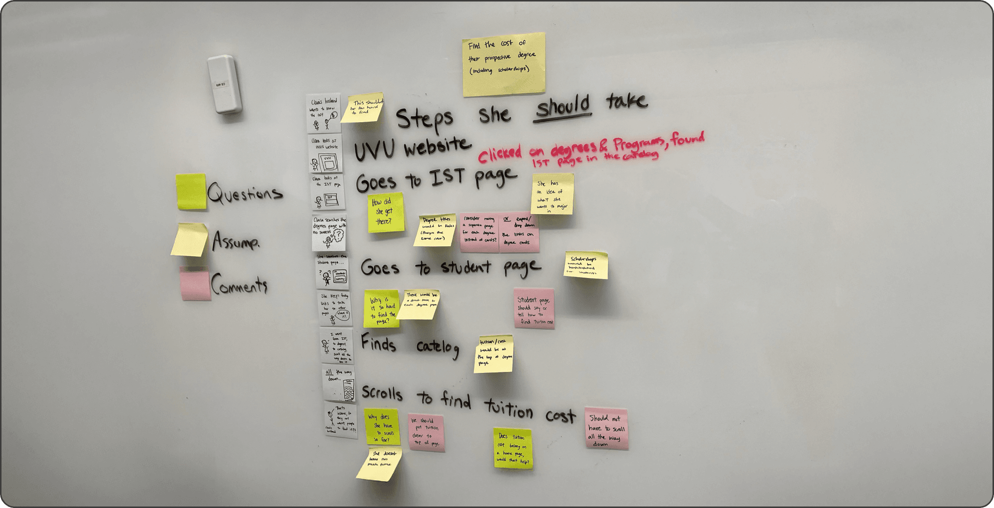
Whiteboarding
After completing the eye-tracking studies, our team conducted a whiteboarding session to synthesize the data and explore solutions. We used sticky notes to capture participant feedback, questions they had while navigating the site, and our team’s observations. The sticky notes were grouped into three main categories: Questions, Assumptions and Comments. This exercise allowed us to collaboratively identify pain points and brainstorm actionable solutions, such as integrating advisor information into a centralized page and adding visual cues to guide navigation.
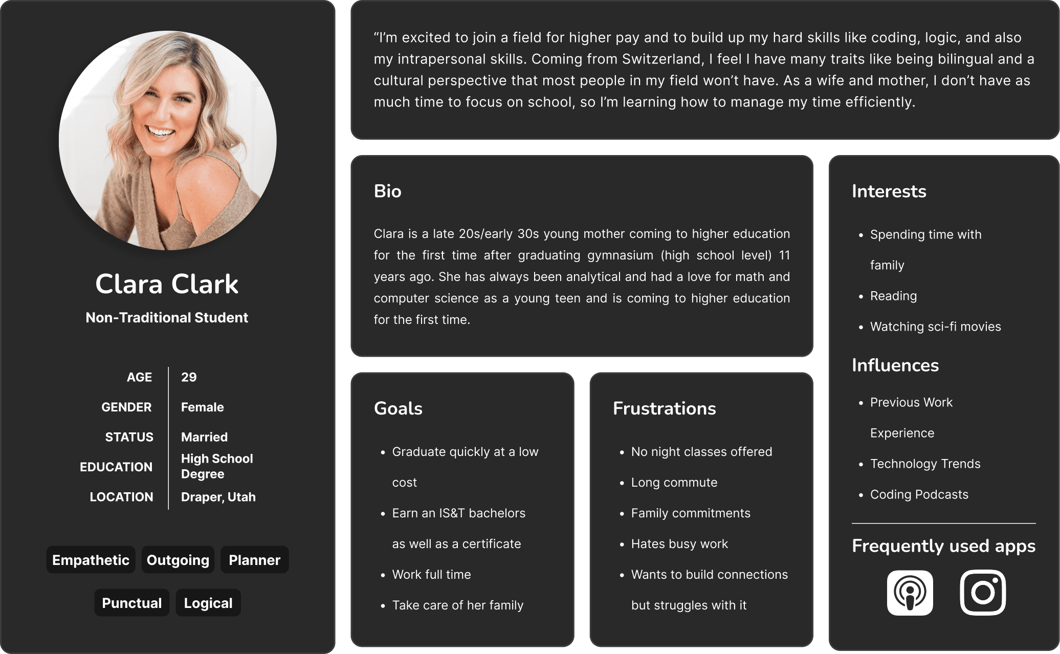
User Persona
To make sure our design decisions aligned with the needs of non-traditional students, we created a user persona based on insights gathered from our research. This persona helped us empathize with our users and keep their goals, challenges, and preferences at the forefront throughout the design process.
Heuristic Evaluation
Our design process began with a heuristic evaluation of the existing IS&T website. Using established usability principles, we systematically analyzed the site to identify issues such as poor navigation, inconsistent visual hierarchy, and an overabundance of static content. This evaluation helped us pinpoint specific areas that required immediate attention and set the stage for the redesign. Images of our annotated evaluations and key findings were documented to provide a clear starting point for the team.
Sketching & Wireframing
Next, we moved into the sketching and wireframing phase, where we began exploring ideas through hand-drawn sketches. This allowed us to quickly brainstorm and iterate on potential layouts and concepts for the redesigned UVU IS&T website. The sketches focused on addressing key pain points identified in our research, things like simplifying navigation and emphasizing critical call-to-action elements.
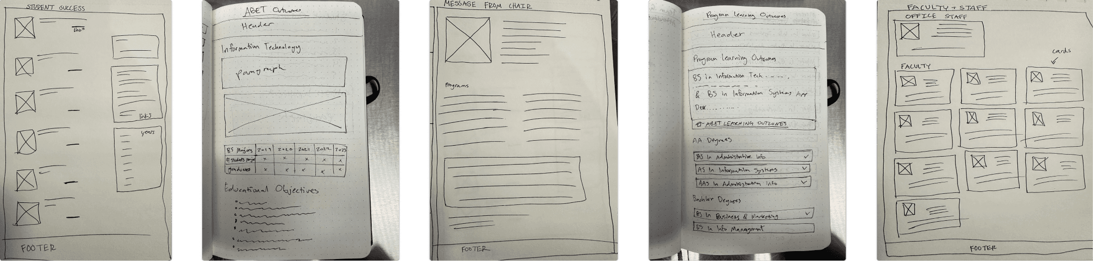
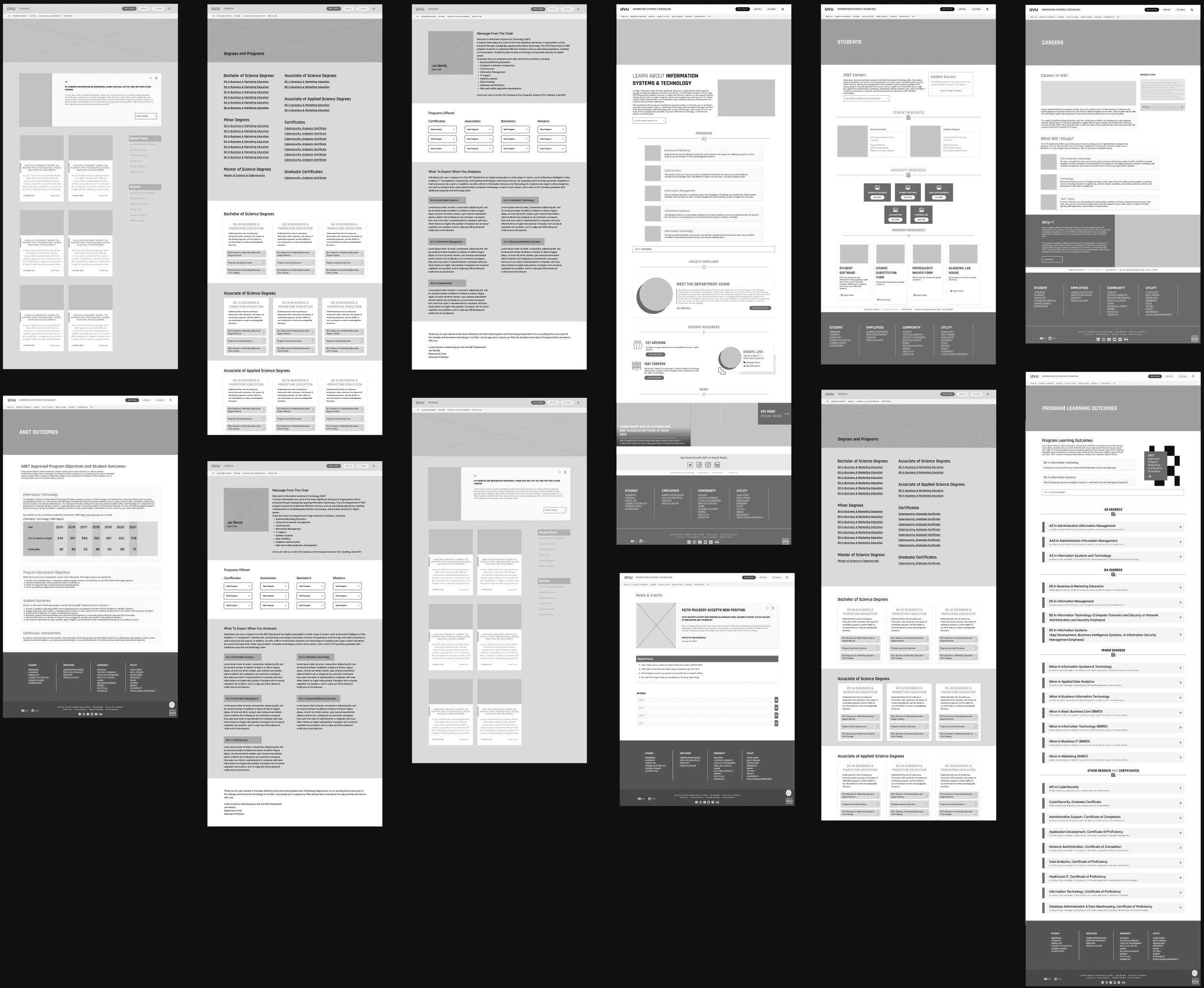
Building on these initial sketches, we transitioned to creating wireframes, which offered a more structured, low-fidelity representation of the site. These wireframes provided a clear framework for the layout, including page structures, navigation paths, and content organization. We ensured our designs were both innovative and user-focused. Stakeholder feedback helped refine these ideas further, setting the stage for our final designs.
Final Design
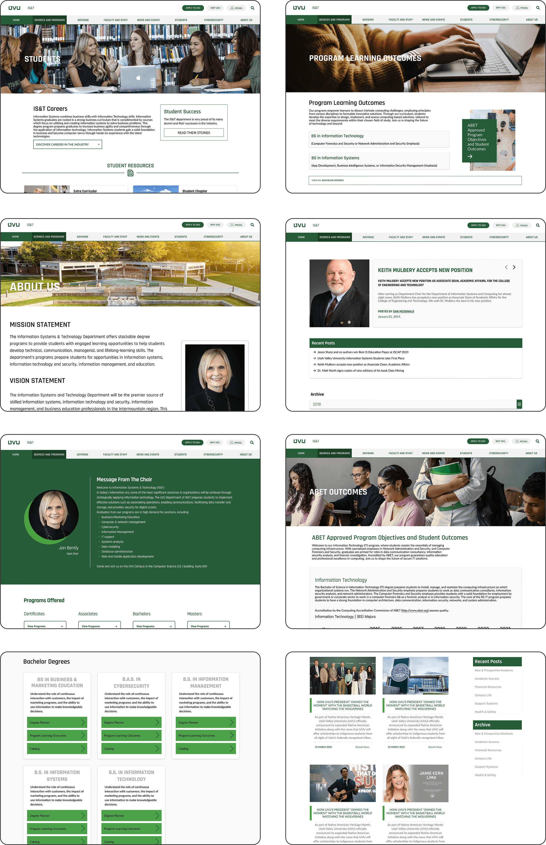
From the wireframes, we developed surface comps that incorporated the finalized visual design elements, including original imagery, a cohesive color palette, and typography tailored to the UVU brand. The high-fidelity designs were then translated into an interactive prototype, allowing us to test and validate the new design with users. This iterative process made sure that the final product addressed the needs identified during the research phase while maintaining a professional and appealing aesthetic.
Reflection
This project taught me the importance of grounding design decisions in user feedback and data. By involving non-traditional students in every phase, I gained a deeper understanding of how to design for diverse audiences. The eye-tracking studies and whiteboarding exercises, in particular, reinforced the value of observational methods and collaborative brainstorming in uncovering hidden pain points.
One area I could improve on in future projects is time management during the prototyping phase. I realized that allocating more time for usability testing could have allowed us to iterate further and refine the design even more. Additionally, I’d like to explore more advanced prototyping tools and techniques to make the testing process as realistic as possible. Overall, this experience has strengthened my ability to approach complex design challenges with a user-centered mindset and a structured process.


