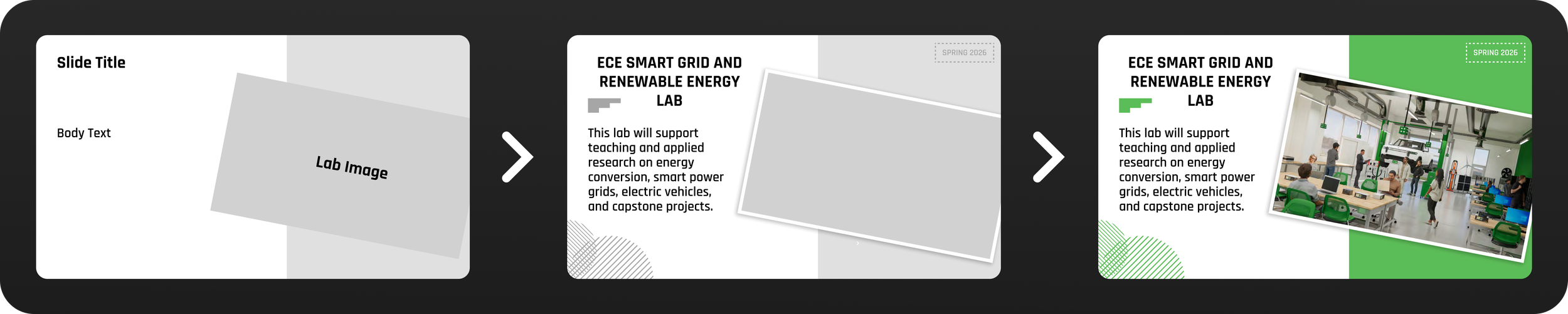
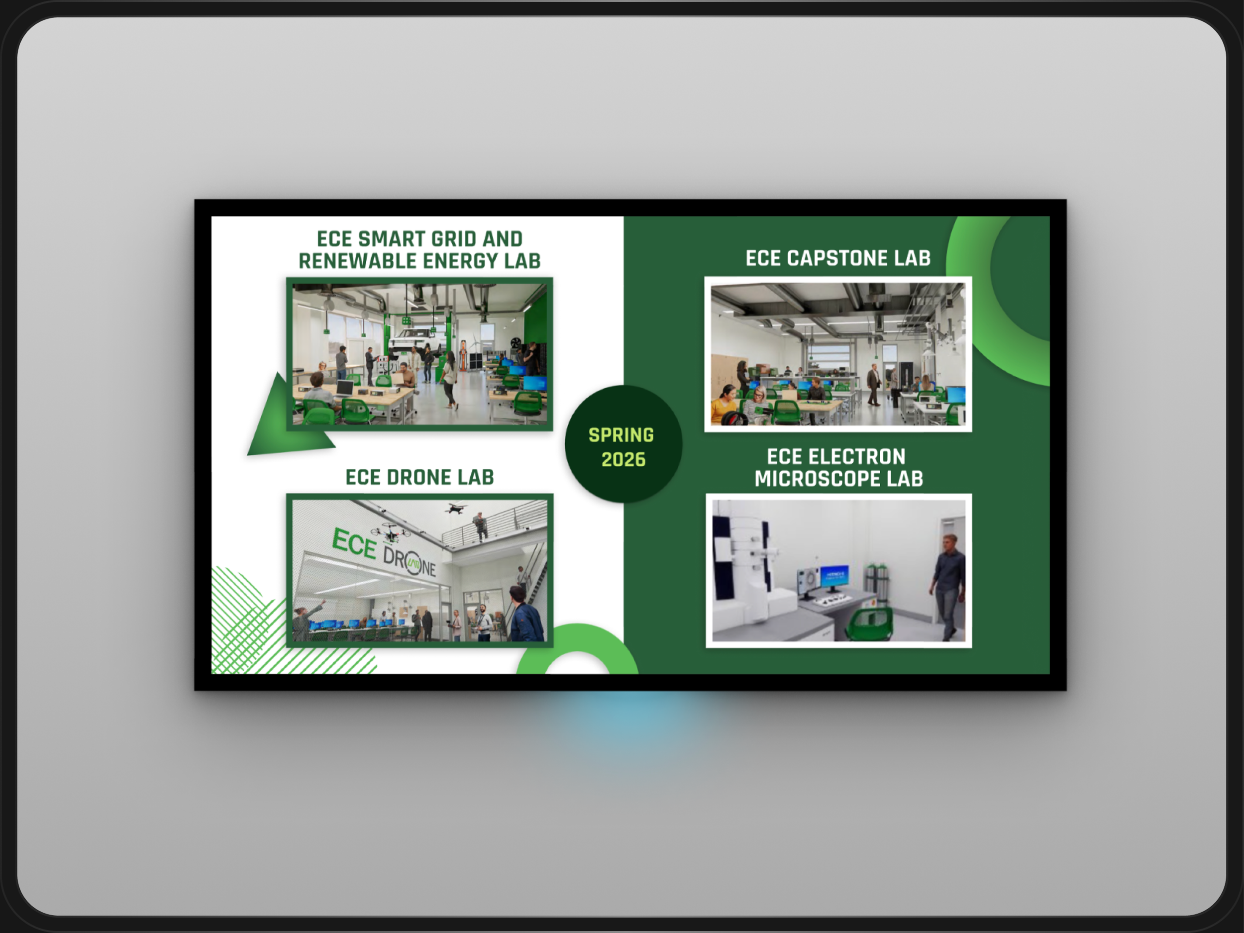
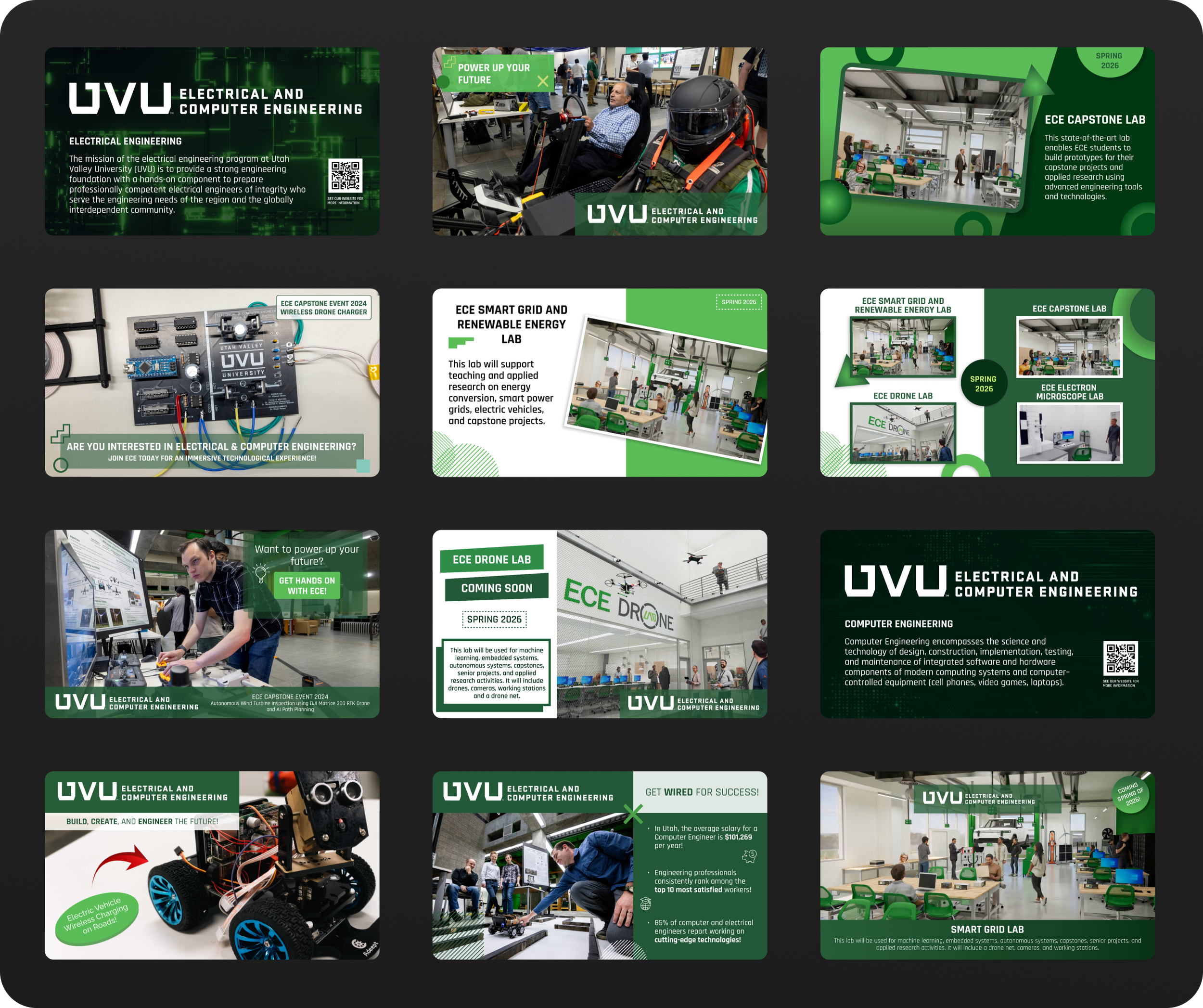
ECE Digital Signage

This project focused on designing digital signage for Utah Valley University’s (UVU) Electrical and Computer Engineering (ECE) department to attract undecided students and encourage them to join the program. Alongside another designer, I collaborated with a member of the UVU marketing team and key stakeholders to create visually engaging, informative, and persuasive displays for large digital screens in campus hallways.

The ECE department sought to promote its new building, featuring their new labs, as part of its effort to expand enrollment. Our challenge was to develop digital signage that would capture students' attention and effectively communicate the benefits of joining the ECE program.

■ OVERVIEW

UVU’s Electrical and Computer Engineering department was facing a unique challenge: despite building a new, cutting-edge facility, they had difficulty attracting students to join their programs. The department was in the process of expanding and had new labs that they wanted to showcase. However, they lacked a clear strategy for communicating the exciting opportunities available to prospective students. The digital signage needed to be an eye-catching and informative tool that would grab the attention of students passing through the hallways and generate interest in the ECE programs. The problem was clear: how could we design digital signage that would engage undecided students, generate curiosity, and ultimately lead them to consider joining the department?

■ THE PROBLEM

To tackle these challenges, we focused on designing signage that was both visually compelling and informative, ensuring it would capture students’ attention in a busy hallway setting. Each issue required a thoughtful design solution:

Lack of awareness → Highlighted key program benefits and new lab facilities

Limited student engagement → Dynamic animations and eye-catching visuals

Unclear messaging → Streamlined content with concise, action-oriented text

By prioritizing visual hierarchy, motion design, and clear calls to action, we created signage that effectively communicated the value of the ECE program while maintaining alignment with UVU’s branding guidelines.

■ RESEARCH

The design process for the digital signage was informed by a combination of insights into effective communication strategies and industry best practices for digital displays. While formal user research was not conducted, we analyzed various examples of digital signage to understand key elements that successfully capture attention and convey information quickly. We focused on ensuring that our designs would be visually engaging and easy to understand, helping to attract prospective students to UVU’s Electrical and Computer Engineering department.

User Persona

Although we did not conduct formal user research, we did develop a user persona to help guide the design process. Our user persona was Wade Warren, a 20-year-old college student at UVU with an undecided major. Wade is tech-savvy and interested in technology, but he has not yet explored the tech programs offered at UVU. He seeks to find a major that aligns with his personality and is looking for ways to meet people with similar interests. Wade’s persona helped us understand his motivations and challenges, ensuring that the digital signage would resonate with students like him—tech-interested, but unsure of what path to take.

In addition to developing a user persona, we examined best practices for digital signage in higher education settings. We researched digital signage used at other universities and organizations, analyzing elements such as visual hierarchy, font choices, color schemes, and calls to action. This research provided inspiration and helped inform the design direction for our project. We also reviewed examples of other digital signage boards to identify effective animation techniques and transitions that could be applied to our own designs, ensuring the final product was both engaging and functional.

The project began with a brainstorming phase where we discussed the needs of the ECE department and what type of messages would be most compelling to prospective students. Once we had a clear understanding of the department’s goals, we set to work designing the digital signage. Using Figma, we created templates and layouts that could be adapted to various pieces of content. The goal was to design screens that were visually appealing, informative, and easy to read. After finalizing the static designs, we used Fable to animate certain slides, adding movement to highlight key information and encourage engagement.

■ THE PROCESS

Throughout the design process, we received weekly feedback from our stakeholders, including members of the ECE department and the UVU marketing team. This feedback was crucial in refining our designs and ensuring that the final product met the department’s needs. In some instances, we adjusted the content to align more closely with UVU’s branding guidelines or to improve the visual flow of the information. One major challenge we faced was staying within the UVU Design System Guidelines, which sometimes required reworking font choices and color schemes. We also had to be mindful of the content’s readability, ensuring that the animation and layout choices did not overwhelm the viewer. The iterative process of gathering feedback, adjusting designs, and refining animations helped us create a polished final product that was both functional and visually striking.

Final Designs

The final digital signage design combines clear, impactful messaging with visually engaging elements to attract prospective students to UVU’s Electrical and Computer Engineering department. We used a clean, modern layout that adhered to UVU’s design guidelines, ensuring consistency with the university’s branding. The animations were designed to grab attention without overwhelming the viewer, with key information like program highlights, lab features, and student projects prominently displayed. Each slide included a clear call to action, encouraging students to learn more about the program and engage with the ECE department. The end result was a polished, dynamic signage system that balanced both aesthetics and functionality, designed to spark curiosity and motivate undecided students to consider the ECE program.

This project taught me valuable lessons in balancing creativity with stakeholder needs. At times, I was eager to explore bold, innovative design concepts, but I had to constantly remind myself to prioritize the end goal: creating signage that was effective in engaging undecided students and promoting the ECE department. One of the key lessons I learned was the importance of clear calls to action and strong visual hierarchy. It was easy to get caught up in the design elements, but the most important thing was ensuring the information was digestible and easily understood. The process of receiving feedback from stakeholders each week allowed us to make necessary adjustments and ultimately produce a final product that aligned with their expectations and achieved the goal of attracting new students.

In addition to these lessons, the project underscored the importance of organization and iteration. We found that creating reusable templates and layouts was critical to maintaining consistency across the signage. This approach also allowed us to work more efficiently, as we could quickly adapt our designs to fit different types of content. Overall, the project was a great learning experience that sharpened my skills in design, animation, and collaboration. I also gained a deeper understanding of how digital signage can be used effectively to engage audiences and convey information in an educational context.

■ REFLECTION